What is your favourite Greek font, and why?
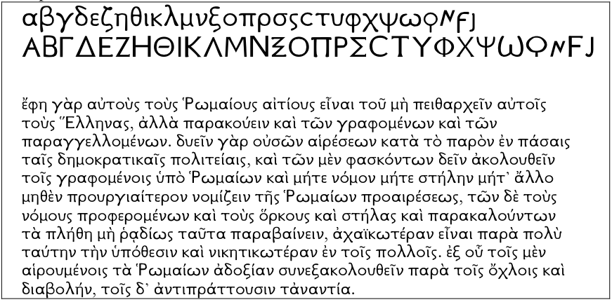
GFS Complutum: Εταιρεία Ελληνικών Τυπογραφικών Στοιχείων


There is a Romantic history to Greek typography. The first fifty years of printing started inauspiciously, with poor, crude carved out Greek letters. But they got steadily better, until their apogee in the Complutensian Polyglot Bible of the 1520s, where they are used in the New Testament.
(I’ve posted about the history and awesomeness of the Complutensian already on my blog: The Complutensian Polyglot, ahead of the times.)
The Old Testament of the Computensian is written in the version of Greek typography that then prevailed for the next two centuries: the italic squiggle, popularised by Aldus Manutius, and taken up because it was more reminiscent of what scribes were doing.
Greek typography only got out of squiggle in the late 18th century, and in the early 20th century typographers were coming to fetishise what could have been, if the early tradition had continued on. Classicists may be familiar with the more modern iteration of fonts inspired by the old style: GreekKeys Athenian/New Athena Unicode.

The Greek Font Society has revived a font based on the Complutensian, although it’s now polytonic rather than monotonic. It’s not a font you’ll get away with for everyday use—people won’t get past the archaisms, like the nu that looks like a mu, or the random lowercase letters that look like capitals.
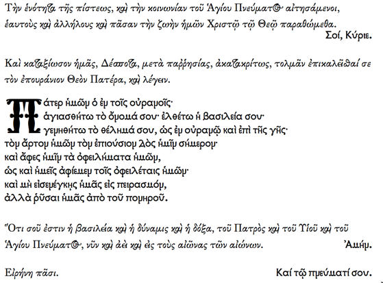
But there is a fearsome symmetry to the font, a stern blockiness, that I adore. Enough to have featured it in my wedding order of service:

Some would say I got married just so I could show off my favourite fonts. But that would be a bit much even for me…